響應式網頁設計:國外的很贊的響應式網頁設計案例
編輯:CSS進階教程
上一篇中我們了解了一下響應式網頁設計是什麼,現在趁熱打鐵,來欣賞一些國外的一些很贊的響應式網頁設計,看看他們是如何實現對PC端浏覽器和移動終端的全面支持的。
想要查看效果很簡單,打開這些頁面,然後縮放浏覽器窗口就可以了——當然,要用chrome/safari/firefox/opera等浏覽器,IE請繞道~~
當然,如果你有發現國內有好的類似設計
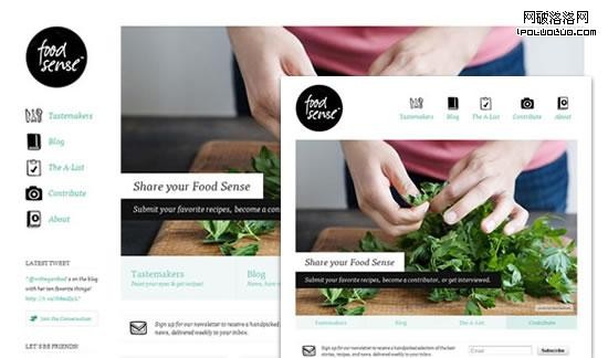
food sense
Forefathers

Form CMS

Havoc Inspired

Jet Cooper
Filidor Wiese

Conferencia Rails

Designing With Data

The Happy Bit

Webdesign Yorkshire

Highway Hurricanes

Simple Bits

2011 dConstruct

Hardboiled Webdesign
Stephen Caver

Nicely Replayed

Electric Pulp

Teixido

Edge of My Seat

Robot or Not

Tee Gallery

Urban Svensson

Camendesign Forum

Authentic Jobs

Lynn and Tonic

CalebAcuity

3200 Tigres

Upper Dog

Five Simple Steps

iaWriter

Red Root

Paul Adamsmith

Miekd

Impact Dialing

Pgrady

51bits

Glitch

Get Skeleton

Illyissimo

More Hazards

Food Sense

Naomi Atkinson Design

Diablo Media

Touch Tech

Greg Mcausland

Visua Design

Glue Isobar

Henry Brown

Boston Globe

ASU Online

10K An Event Apart

Helloxie

Melt Media

Space150

Colly

Less Framework

Hicks Design
Five Details

Think Vitamin

Naomi Atkinson

8Faces

Clearleft

Lanyrd

Lapse

See Sparkbox

Design made in Germany Magazine 5

Earth Hour

CSS Grid

St. Pauls School

Cognition

Sasquatch Festival

Forge Ideas

Sweet Hat Club

Ribot

Asbury Agile

do Lectures
Made by Splendid

Yaron Schoen

Trent Walton

Owltastic

Kiskolabs

Staff Anstorp

Dust and Mold

Spigot Design

Convergese

CSS-Tricks

- 上一頁:響應式網頁設計和移動互聯網
- 下一頁:使用偽元素來實現圖片替換的兩種方法
小編推薦
熱門推薦