網頁制作poluoluo文章簡介:2010年blog設計中最有趣的趨勢:簡單,品牌整合,重視排版布局,單頁設計,使用大圖片,運用產生立體感的手法,
2010年blog設計中最有趣的趨勢:簡單,品牌整合,重視排版布局,單頁設計,使用大圖片,運用產生立體感的手法,
Web 2.0
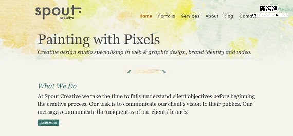
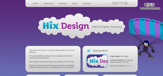
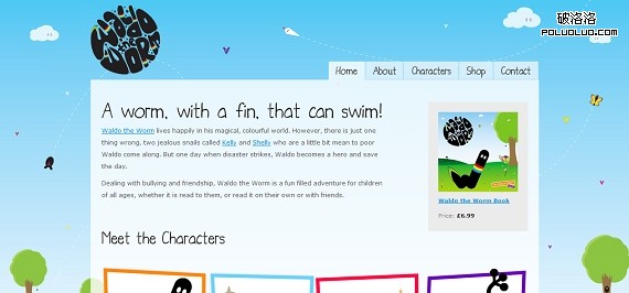
The design trend associated with Web 2.0 is actually multiple trends rolled into one.
- Round corners
- Glossy/Shiny graphics
- Big, prominent graphics
- Larger, non-serif typography
網頁制作poluoluo文章簡介:2010年blog設計中最有趣的趨勢:簡單,品牌整合,重視排版布局,單頁設計,使用大圖片,運用產生立體感的手法,
Simple
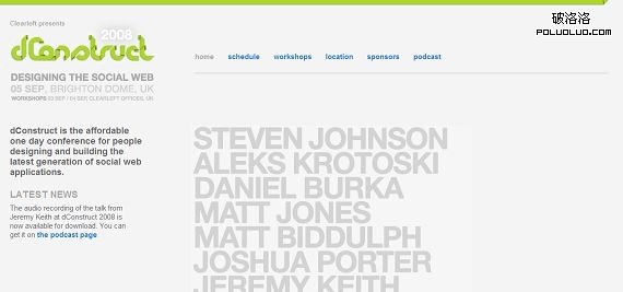
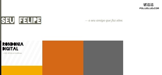
I’ve often said, a designer who can pull off a simplistic design is just as talented as the one that can create a super-complex one. That is because a simple design is more than just leaving elements out. It is about balancing design, carefully choosing colors and typography, and expertly integration navigation and content to create an effective and smooth design.
網頁制作poluoluo文章簡介:2010年blog設計中最有趣的趨勢:簡單,品牌整合,重視排版布局,單頁設計,使用大圖片,運用產生立體感的手法,
Whole site branding integration
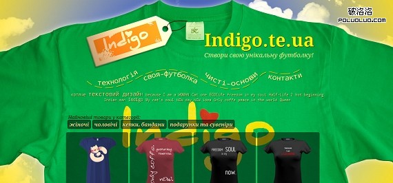
Orginally, web designs included a header, with a logo and a content section, with the content. Recently, designers are pushing the limits by incorporating colors, logos, branding, messaging and graphics throughout the entire site, not just the header.

網頁制作poluoluo文章簡介:2010年blog設計中最有趣的趨勢:簡單,品牌整合,重視排版布局,單頁設計,使用大圖片,運用產生立體感的手法,
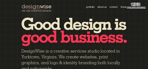
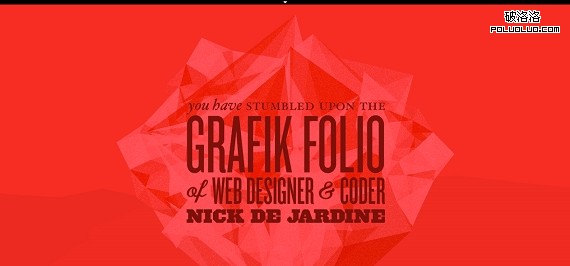
Advanced typography
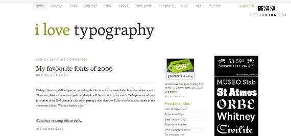
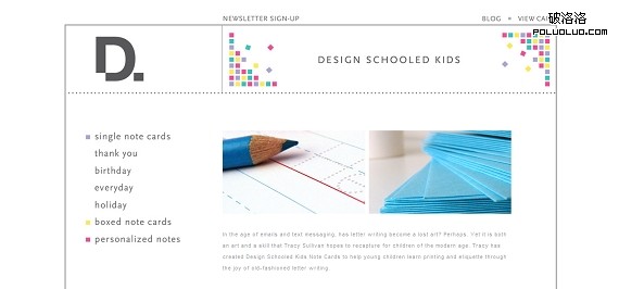
Web designers are putting much more thought into typography. There are many resources popping up to pick a typography set. Once upon a time, designs included an h1, h2, and p style. Now some designs include dozens of different font stylings.
網頁制作poluoluo文章簡介:2010年blog設計中最有趣的趨勢:簡單,品牌整合,重視排版布局,單頁設計,使用大圖片,運用產生立體感的手法,
Single page design
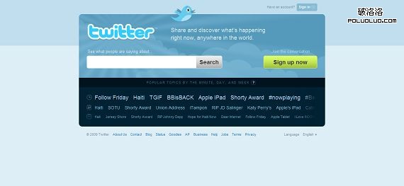
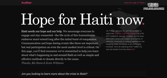
Along with designing simpler sites, designers are exploring ways to keep content on one page. In portfolios, showcases or simple informational sites, developers are looking for ways to put all content on page one so the readers sees it all without having to click through anywhere. The example below you will recognized as Twitter. As arguably one of the top 5 sites on the web, everything you need to know about Twitter is located on the front page.
網頁制作poluoluo文章簡介:2010年blog設計中最有趣的趨勢:簡單,品牌整合,重視排版布局,單頁設計,使用大圖片,運用產生立體感的手法,
AJAX
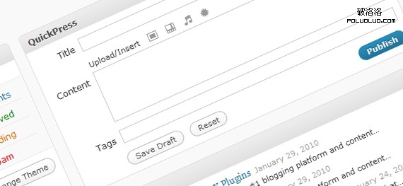
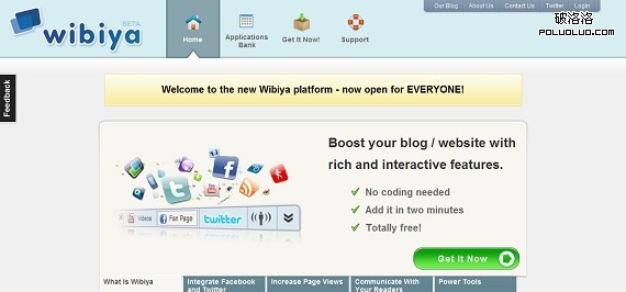
You know AJAX (asynchronous JavaScript and XML), it is that cool interaction when you click something on a site and it changes, without reloading. This is a huge advancement in web design technology and allows users to get the content they desire without moving about the site. Most major publishing platforms have integrated AJAX into their codex. The leader is easily seen in all the Wordpress AJAX plugins.
網頁制作poluoluo文章簡介:2010年blog設計中最有趣的趨勢:簡單,品牌整合,重視排版布局,單頁設計,使用大圖片,運用產生立體感的手法,
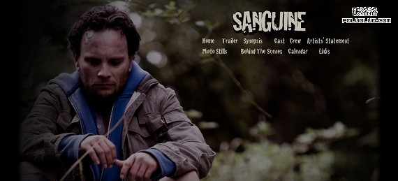
Large images
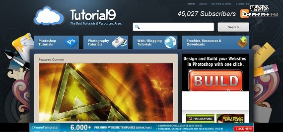
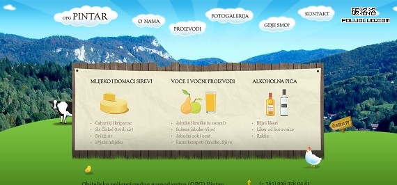
Advances in compression technology, increased internet access speeds have allowed designers to grow the size and quality of images they use in new designs. This makes for an appealing and graphically pleasing design.
網頁制作poluoluo文章簡介:2010年blog設計中最有趣的趨勢:簡單,品牌整合,重視排版布局,單頁設計,使用大圖片,運用產生立體感的手法,
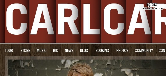
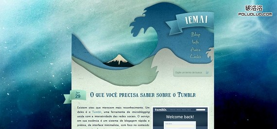
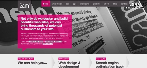
Perspective and depth
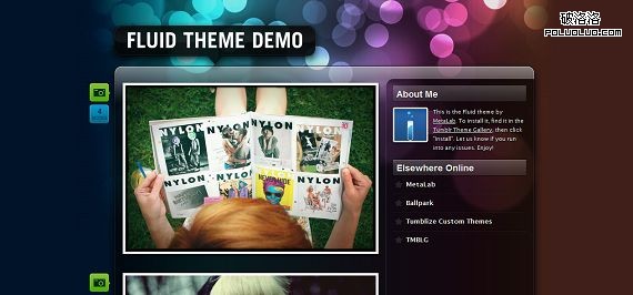
Strategically using dropshadows, angles and overlaps, designers have added a 3rd dimension to web design that was previously limited to 2 dimensions. Using these techniques, designers are able to draw user attention to specific areas consistent with the goals of the site. Perhaps conversion forms, twitter buttons or featured content.
網頁制作poluoluo文章簡介:2010年blog設計中最有趣的趨勢:簡單,品牌整合,重視排版布局,單頁設計,使用大圖片,運用產生立體感的手法,
Themed designs
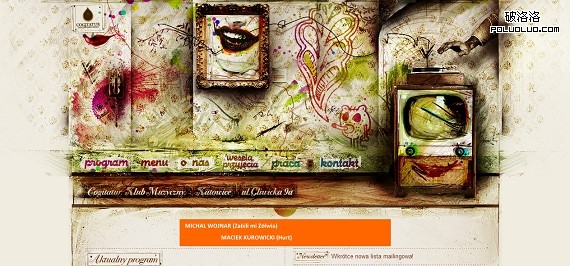
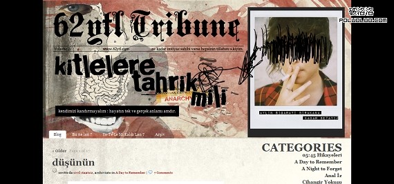
Designers are adding overarching themes like grunge, retro, whimsical, etc. These themes tie together all elements of a design and give the user a feeling of continuity, adding to the overall experience.
網頁制作poluoluo文章簡介:2010年blog設計中最有趣的趨勢:簡單,品牌整合,重視排版布局,單頁設計,使用大圖片,運用產生立體感的手法,
Specific purpose
Designers have realized that themes should be designed for a specific purpose such as magazine, portfolio, green, blogging, etc. Designing for a purpose allows the designer and webmaster to focus on function and not generalize the design so it can be used across multiple different sites.
