網頁制作poluoluo文章簡介:大部份導航都使用了水平或垂直的菜單設計,注重結構和體驗。也有一些設計師在導航上做實驗。本文搜集了這些案例希望能激勵你 打破常規和固有思維,在設計中配合訴求、受眾和產品類型來進行創意的設計。
不同凡響的導航設計。大部份導航都使用了水平或垂直的菜單設計,注重結構和體驗。也有一些設計師在導航上做實驗。本文搜集了這些案例希望能激勵你 打破常規和固有思維,在設計中配合訴求、受眾和產品類型來進行創意的設計。65 Media
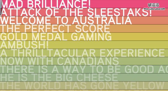
65 Media are group of passionate individuals that produce fantastics experiences. They have creativity running through their vains, just take a look at their fantastic homepage:
65 Media
Carefully Considered
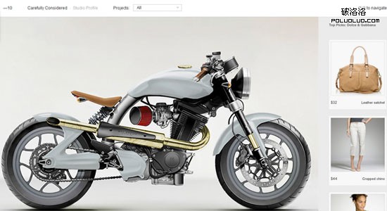
There are a few websites out there that use a horizontal layout, Carefully Considered is one of them. However, I like how they have made browsing effortless, just click to the right to view the next project and double click to read about the project.
Carefully Considered
Fauborg
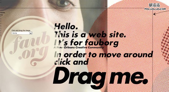
A great website that allows you to browse both horizontally and vertically smoothly by dragging and dropping.
Fauborg
Gritti Rollo
Gritti Rollo has demonstrated how simplicity can be perfect navigation. Along side some beautiful hover effects and revealing areas with jQuery, Griiti Rollo has produced a fantastic and inspiring website.

Gritti Rollo
Daniel R Leyva
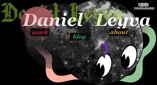
Daniel is someone who clearly has lot of creativity. He has mastered the parallax effect supplied by the jQuery library and created a 3D environment in which to browse the content. I feel with a background image containing a little perspective would work wonders with this design.
Daniel R Leyva
Organic Grid
Organic Grid have taken a similar approach to 65 Media (vica versa), a simple vertical menu with a gradient of backgrounds. With some beautiful sounds complimenting the mouse over and beautiful transitions throughout the website, it is a joy to browse.
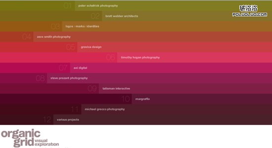
Organic Grid
Khai Liew
Khai Liew has gone for the horizontal but vertical approach. Although it can be hard to read the menu item names without tilting your head slightly, the design alongside beautiful transitions is incredibly unique.
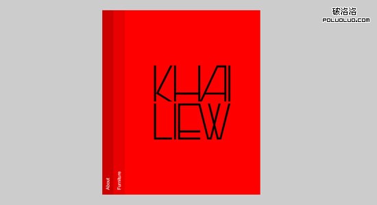
Khai Liew
Young
When looking at Young for the first time, you predict that it scrolls horizontal, however with no horizontal scrollbar appearing, you begin to question yourself. However, once hovering over work you notice the black bar thicken; indicating that it is a scroll bar, very stylish.
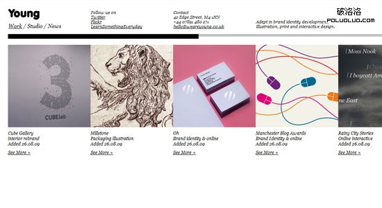
Young
Hello Goodlooking
There are very few websites that try something totally different. Hello Goodlooking is one of the few. Navigation is based around a mind map design. Menu items are clicked to reveal new items and content. A stunning example of creativity using Flash.
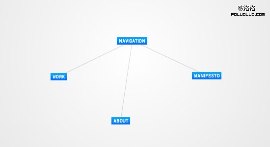
Hello Goodlooking
WallSwaps
Wallswaps is a great idea procured by Erskine Design. It is a virtual cork board where companies and designers can add their work, business cards and a lot more. A beautiful idea with some exceptional navigation.
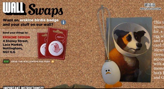
WallSwaps
Screen Vader
Now this site is a must see! I am yet to see any other site demonstrating such enormous creativity.
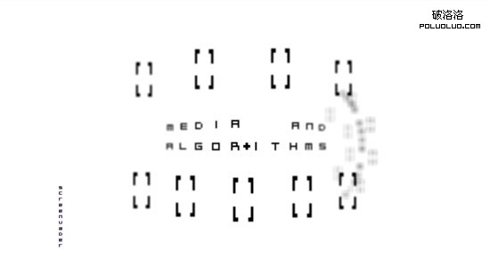
Screen Vader
IAAH
Another click and drag site, but unlike its counterparts it is incredibly smooth. It is a joy to navigate and I am sure you will spend just as long as I did browsing the site.
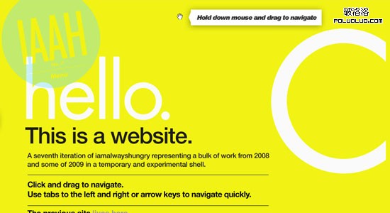
IAAH
Daffy’s
Daffy’s take a look at traditional navigation techniques and just pushes them aside. Mouse over each menu item to reveal a a description and entirely different background image.

Daffy's
Frost Design
Frost Design have developed and smooth coverflow type navigation to display their work. Incredibly smooth and incredibly effective.
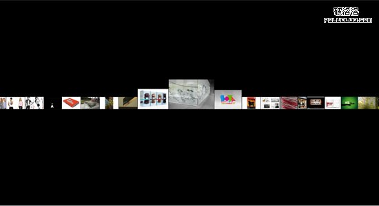
Frost Design
All about Photography
Another click and drag website, however this site use the google maps navigation methods to browse the website. Unsure how they implemented this so hats off!
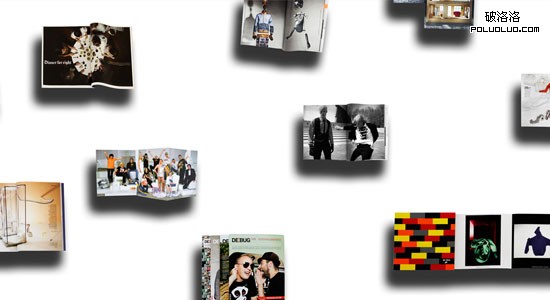
Henriette Primus
Joshua Distler
Josh takes a different approach to typical web design. Based around a grid, the main homepage is made up entirely of navigation withe each menu item taking up a different amount of blocks. Not sure what determines how many blocks an item takes up but nonetheless a very creative design.
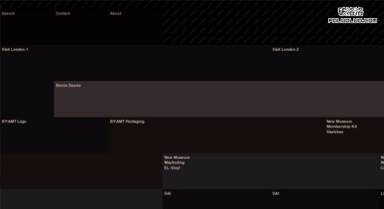
Joshua Distler
Design is Kinky Studio
A website that allows the user to browse both horizontally and vertically, by hovering the cursor over the arrows positioned at the edges of the screen. Also allows you to zoom in and out.
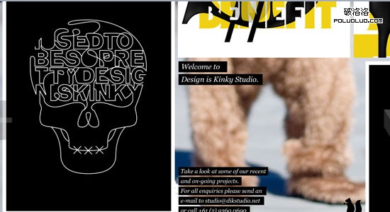
Design is Kinky Studio
BBH
Flash just blows my mind sometimes. The BBH homepage features a rotating world in which to navigate. One can position the mouse around the screen to determine which way the world rotates or one can click the world and drag yourself around its surface. What’s more impressive is the exquisite transitions throughout the website.
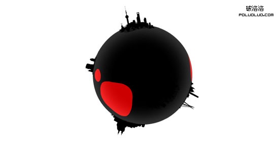
BBH
Fons Hickmann m23
Not just a standard jQuery scrollto website. Fons Hickman m23 has a lot of creative nooks and crannies to seek out.

Fons Hickmann m23
Margaret London
Beautiful navigation and transitions.

Margaret London
Thibaud
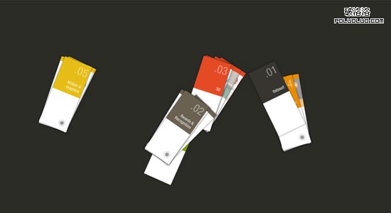
Probably the most creative navigation I have ever seen. How was this achieved? By finding inspiration from objects and the environment around. Get outside once in a while, don’t let the CSS galleries plague your mind.
Thibaud
Nick Jones
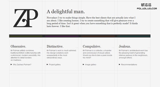
Nick demonstrates how a vertical menu can be both appealign and fun to browse through.
Nick Jones
Established
What seems to be just a large vertical menu, actually contains the content as well. Click on the arrow to the right of each menu item to have the content smootlhy scroll in.

Established
24 ways
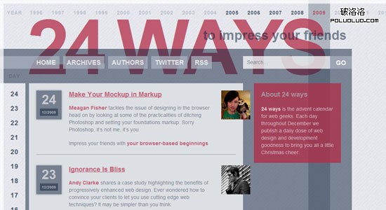
Athough 24 ways is comprised of just horizontal and vertical menus, it is the way they have been made that demonstrates creativity. With full height and translucent backgrounds the end result is very appealing.
24 ways
Christopher Hewitt
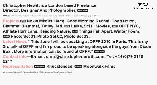
The simplest navigation you will probably see. Chris shows how effective a simple list can be. Check out the gorgeous filtering as well.
Christopher Hewitt
Alp Tugan
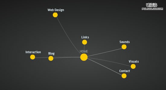
Similar to Hello Goodlooking, Alp Tugan’s navigation is based around mind map design.
Alp Tugan
Zachary Pulman
Zachary has designed and developed a masterpiece. I’m sure you will have as much funs navigating through his website than I did.

Zachary Pulman
Wonderwall
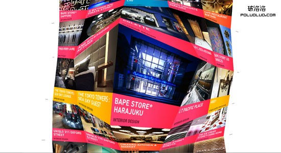
Probably not the most practical navigation, but still damn impressive!
Wonderwall