網頁制作poluoluo文章簡介:為你的web設計增添令人贊歎的元素。人們會通過內容、設計和那些wow!的小細節來記住一個網站。本文中展示了解10個擁有這種元素的網站,他們通過特別設計的動畫、交互事件、背景和3D效果給人們留下了深刻印象。
為你的web設計增添令人贊歎的元素。人們會通過內容、設計和那些wow!的小細節來記住一個網站。本文中展示了解10個擁有這種元素的網站,他們通過特別設計的動畫、交互事件、背景和3D效果給人們留下了深刻印象。Analog
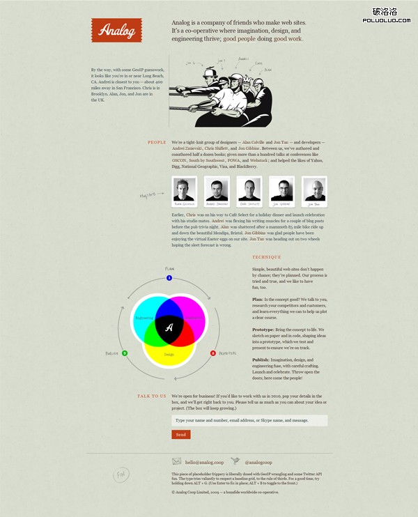
Analog is a company of friends who make web sites. It’s a co-operative where imagination, design, and engineering thrive; good people doing good work. The website is very simple, but it definitely gets the job done.
The “Wow” Factor
Try pressing Alt+G and see what happens. Also, mouse-over the mugshots.
Face
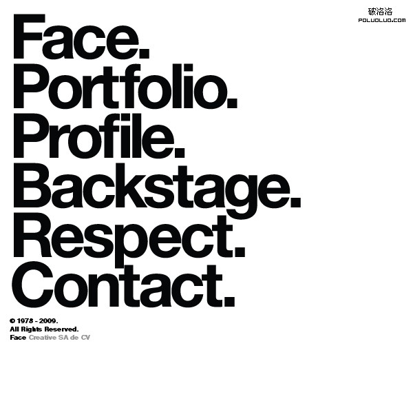
Face is an intelligence-driven multidisciplinary design studio, based in Monterrey, Mexico whose work range includes design solutions, advertising, editorial projects and custom publishing, corporate identity and brand development. The site is very minimalistic, and at first look, it doesn’t seem to be exciting at all.
The “Wow” Factor
Mouse-over the navigation and you’ll be surprised.
Flourish
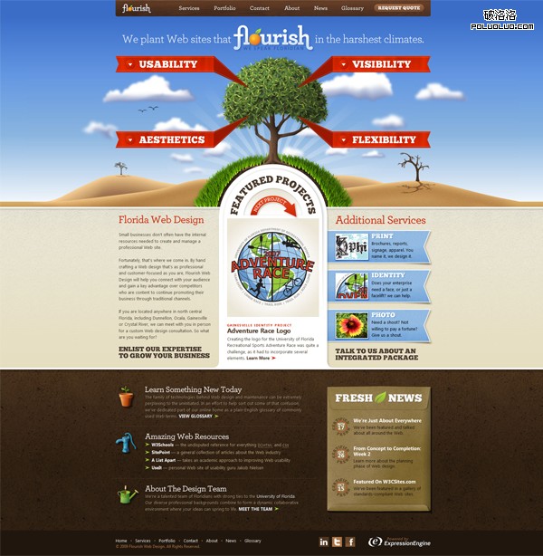
Flourish is a full-service design studio with a decided focus on the Web. With additional experience in brand identity, print design and photography. This is probably one of my favorite websites in the internet. It is well designed and it has some great details that really make you say "wow!"
The “Wow” Factor
When clicking one of the 4 red banners, the tree changes. Also, the featured projects slider is great.
HutchHouse
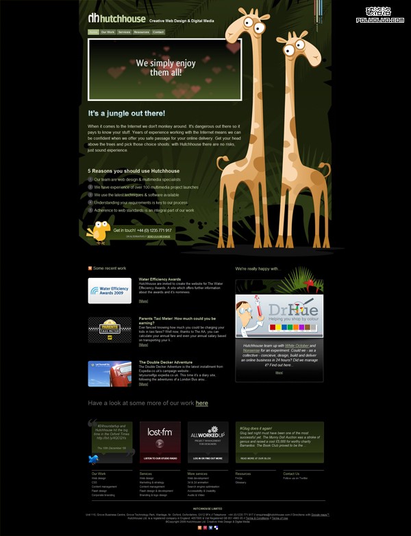
The Hutchhouse team have a mass of real life web design experience creating interfaces for simple brochure websites through to eCommerce, intranet and social networking sites. I love the giraffe illustrations in this website.
The “Wow” Factor
On the top right corner, try switching the theme and you will see the giraffes in different environments. They have a space theme, a night theme, a jungle theme, and a depth theme.
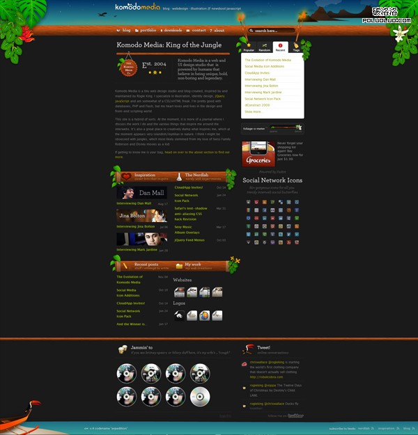
Komodo Media
Komodo Media is a tiny web design studio and blog created, inspired by and maintained by Rogie King.He specializes in illustration, identity design, jQuery, JavaScript and is somewhat of a CSS/xHTML freak. He is pretty good with databases, PHP and Flash, but his heart loves and lives in the design and front-end scripting world.
The “Wow” Factor
Most of you have probably seen this website already, but the "wow" factor is definitely the foliage-o-meter. I still haven’t seen any website do anything similar to what he has done.
Riot Industries
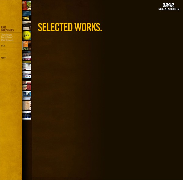
Riot Industries is the personal portfolio of designer Phil Renaud. He is a dual citizen, born and raised in Windsor, Ontario, Canada, which is basically Canadian Detroit. The website has a very nice texture to it, and the color palette really works well.
The “Wow” Factor
Mouseover any of the project thumbnails and the title will quickly slide out. Very neat effect!
Traffik
Traffik is a CMS for designers, built for business. Traffik offers supperior creative liberty compared to other CMS products. Finally a content management system that doesn’t hinder your CSS talents or your coding deficiencies!
The “Wow” Factor
At first glance, the website background just has a normal bokeh design. Try moving your mouse around it and the fun begins.

Work[at]Play
Work at Play builds digital experiences that are capturing the engagement generation. They specialize in building interactive social-networking applications, virtual marketplaces and unique digital content for the web. Headquartered in Vancouver, British Columbia, Work at Play was recently recognized as one of the region’s fastest growing companies.
The “Wow” Factor
I really like the way that they did the work section. Try clicking on one of the projects and you will see a cool 3D, rotating effect.
![Work[at]Play](https://www.divcss.online/divcssbuju/UploadFiles_7251/201612/2016122712384749.jpg)
Yaili
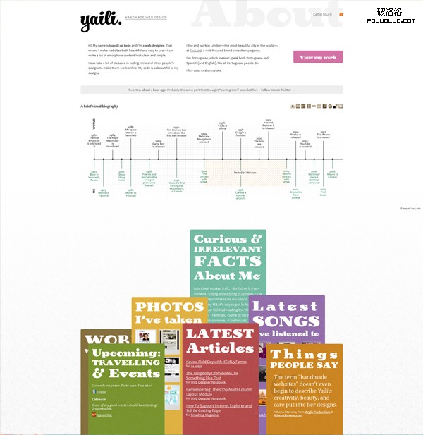
Yaili is the website of Inayaili de León a web designer from London, England. She takes a lot of pleasure in coding other people’s designs to make them work online.Her code is as beautiful as her designs.
The “Wow” Factor
The bottom area of her website is wonderful. Try dragging the different sections around. Also, the way that her work section is laid out is excellent.
Eric Johannson
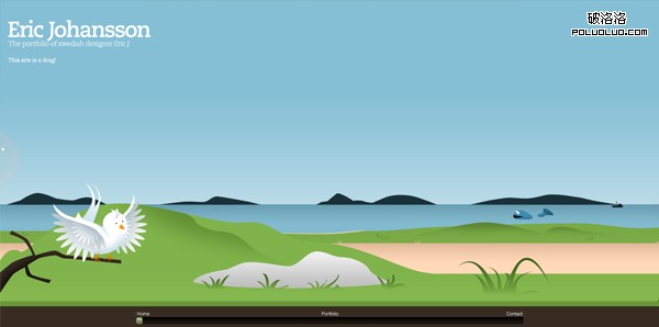
Eric Johansson is a Swedish designer. I really enjoyed viewing his website. The whole design is very enjoyable and you will definitely remember this website.
The “Wow” Factor
Ok, this one is a secret. I won’t tell you what happens, but just drag the scroll-bar to the right to see something really cool, I promise, you won’t be disappointed. 
- 上一頁:設計參考:不同凡響的網站導航設計實例
- 下一頁:表格變填空與冷冰冰的網頁對話