網頁制作Poluoluo文章簡介:Paul Boag討論一些關於制作良好的行動召喚按鈕的技術.
Having an effective call to action is an essential part of any website. A call to action is not just limited to ecommerce sites. Every website should have an objective it wants users to complete whether it is filling in a contact form, signup for a newsletter or volunteering their time.
A call to action provides…
- Focus to your site
- A way to measure your sites success
- Direction to your users
How then do you create an effective call to action? Here are 10 techniques which help achieve just that.
1. Lay the groundwork
Before a user is willing to complete a call to action they have to recognise the need. Infomercials do this very well. Before they ask people to respond, they first identify a problem and present a product that solves that problem.
You also need to communicate the benefits of responding. What will the user get out of completing the call to action?
Take for example the VoIP service Skype. Immediately above their call to action (a download button) they have the following text:
Make calls from your computer — free to other people on Skype and cheap to phones and mobiles around the world.
They clearly explain what the user will get by downloading Skype.

Skype clearly show the benefits of downloading their application
2. Offer a little extra
Sometimes you may have to sweeten the deal to encourage users to complete a call to action.
Incentives could include discounts, entry into a competition or a free gift. This is the approach Barack Obama used on his fund raising website. If you made a donation of $30 or more you got a free t-shirt.

If you donated $30 or more to the Barack Obama election campaign you got a free t-shirt
Of course the beauty of this offer was that not only did he pursued you to donate, he also turned you into an advertising billboard!
3. Have a small number of distinct actions
It is also important to be focused in your calls to action. Too many and the user becomes overwhelmed. Studies in supermarkets have shown that if the shopper is presented with too many varieties they are less likely to make a purchase.
By limiting the number of choices a user has to make we reduce the amount of mental effort. Effectively you guide the user around the site step by step.
The number of appropriate actions will vary from site to site. However, it is not so much the number of actions as the distinctiveness of each.
Take for example pbwiki.com. They have three calls to action:
- Create a wiki
- View Demo
- Buy now
Although three is not an unacceptable number, there is not a clear distinction between ‘create a wiki’ and ‘buy now’. What should I do first – buy a wiki or create one? I am confused. A better approach would be to push the buy option later in the process once the user has committed to building a wiki.

The three calls to action on the pbwiki homepage are not clearly distinguished
4. Use active urgent language
A call to action should clearly tell users what you want them to do. They should include active words such as:
- Call
- Buy
- Register
- Subscribe
- Donate
All of these encourage users to take an action.
To create a sense of urgency and a need to act now, these words can be used alongside phrases such as:
- Offer expires March 31st
- For a short time only
- Order now and receive a free gift
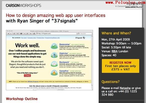
Carsonified use this approach when selling their workshops. To create a sense of urgency they offer discounts to those who signup early.

Carsonified create a sense of urgency by offering a discount to those people who sign up early to their workshops
5. Get the position right
Another important factor is the position of your call to action on the page. Ideally it should be placed high on the page and in the central column.
picsengine.com does this well placing their ’see in action’ centrally on the page above the fold.

Picsengine focuses users on their call to action by placing it centrally on the page.
6. Use white space
It is not just the position of your call to action that matters. It is also the space around it. The more space around a call to action the more attention is drawn to it. Clutter up your call to action with surrounding content and it will be lost in the overall noise of the page.
PlanHQ does an excellent job of focusing users of their calls to action by surrounding them with a lot of empty space.

PlanHQ draws attention to their calls to action by surrounding them with empty space.
7. Use an alternative colour
Colour is an effective way of drawing attention to elements, especially if the rest of the site has a fairly limited palette.
Things (the GTD application for the mac) does this expertly on their website. While the rest of their site is predominately muted blues and grey, their calls to action are highlighted orange. This extreme contrast leaves you in no doubt as to the next thing you should do.

The Things website draws attention to its calls to action by using a constrasting colour
Of course never rely solely on colour because many users are colour blind and will not see the contrast.
8. Make it big
As web designers we often get annoyed with clients who ask us to make things bigger. It is certainly true that size isn’t everything. We have already established that position, colour and white space are equally important.
However it cannot be denied that size does play a large part. The bigger your call to action, the more chance it will be noticed.
Mozilla have certainly taken this approach to heart on the firefox homepage where their download link dominates the page.

Mozilla uses size to draw attention to their call to action
9. Have a call to action on every page
A call to action should not just be limited to the homepage. Every page of your site should have some form of call to action that leads the user on. If the user reaches a dead-end they will leave without responding to your call.
Your call to action does not need to be the same for each page. Instead you can use smaller actions that lead the user towards your ultimate goal.
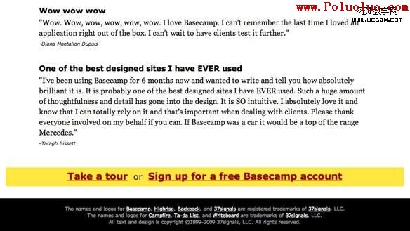
37 Signals understand the importance of having a call to action on each page. At the foot of every page of their Basecamp website they clearly display links to their tour and signup pages.

Basecamp has a call to action at the foot of every page
10. Carry the call through
Finally, consider what happens when a user does respond to your call to action. The rest of the process needs to be as carefully thought through as the call to action itself.
One particular word of warning – if you require users to provide personal data about themselves, resist the temptation to collect unnecessary information.
Marketing people in particular like to build up demographic information. Although I can appreciate the value of this, it brings a danger users will drop out of the process.
Wordpress.com is an excellent example of how to minimise the amount of data collected. They only ask for the minimal information required to setup a blog.

Wordpress miminise the amount of information required to setup a blog.
Conclusions
An effective call to action is the linchpin of a successful site and involves drawing together best practice in usability, creative visual design and powerful copy writing.
However, if it is done right it can generate real measurable return on investment and in the current economic climate that is what we all want.
- 上一頁:如何創建有效的行動召喚按鈕
- 下一頁:網頁設計師:好的行動召喚按鈕的組成