網頁制作poluoluo文章簡介:今天帶來用字體的變化設計的logo,這個趨勢已經有很長一段時間了,字體本身就具有簡潔,易讀的特性,用字體的變化來設計logo方法包括:改變顏色,大小,留白,間距,變形,透視,再次排版,加輔助圖案,合並字體,字體局部形象化等等,這裡我們挑選出72個此類logo.
今天帶來用字體的變化設計的logo,這個趨勢已經有很長一段時間了,字體本身就具有簡潔,易讀的特性,用字體的變化來設計logo方法包括:改變顏色,大小,留白,間距,變形,透視,再次排版,加輔助圖案,合並字體,字體局部形象化等等,這裡我們挑選出72個此類logo,和大家一起欣賞學習!
1. Killed Productions
Who killed letter i?
2. Wrong / Right
Really smart logo!

3. TypeFACE
Typeface: word-play: face from the type and letter T.

4. Galeria 291
Just loving this logo, great stylization!

5. Twins
Very popular logo already, but thought I still share it in typography section.
Author’s comment: “Logo was made for a bold creative team consisting of two people. Two people being brothers …and fortunately born on the same day. TWINS was a suitable name for the two. To reflect the essence of the duo, a bold typeface was created to reflect the boldness of their approaches. The number 2 was integrated to show the creativeness of their ideas.”

6. TicToc Clocks
Just smart logo, which ring the bell!

7. Gizzy bear
Author’s comment: “Gizzy bear is how a little kid might say grizzly bear. Mark is a lower case g bear and paw.”
Just genious!

8. Artists United
Simple, artistic and very clever – all in one place!

9. Sticky
Very good logo – yes, sticky!
10. Snap
Oh, snap – logo with very clear message.

11. Shift

12. Time watch
Very obvious concept – great idea!

13. Upside down productions
Each letter form is either another letter or itself flipped upside down… (umop episdn)

14. M1llion
15. Fuel Fitness
Logo designed for a fitness trainer. Looks like a shoe lice presented in good way.

16. Logotomy version2
17. Microgreen
Author’s comment: “G — microscope + green = microgreen”.

18. Review Code
Author’s comment: “Concept for a consulting company”. Creative and reads very well too!

19. Looks of love
Logo for woman underwear store – I think very appropriate and elegant logo!

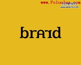
20. Brand
網頁制作poluoluo文章簡介:今天帶來用字體的變化設計的logo,這個趨勢已經有很長一段時間了,字體本身就具有簡潔,易讀的特性,用字體的變化來設計logo方法包括:改變顏色,大小,留白,間距,變形,透視,再次排版,加輔助圖案,合並字體,字體局部形象化等等,這裡我們挑選出72個此類logo.
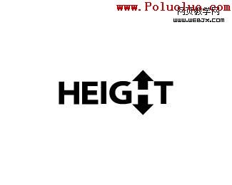
21. Height
Smart way to display Height and letter H.
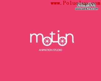
22. Motion
Creative dynamic logo looking like some kind of mechanism.
23. Crown
Simple, clean yet strong mark that could be used for almost all business.

24. Precision Networking
Precision in logotype, stylized E letters and beautiful outcome!

25. HALF
Did you know how half of letters can be displayed and separated just by stylized straight, invisible line? Real beauty.

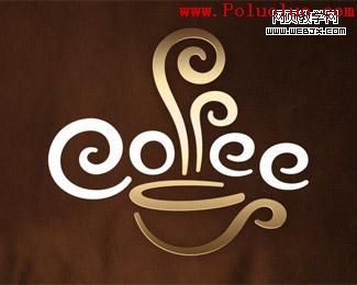
26. Coffee Cup
27. Twenty-four Seven
28. TalkMore
Already classic and famous logotype with smart little accents.
29. Invizio

30. HIGHROAD
How high? Smart perspective logo with depth.

31. UP
Progressive logo, I really like it!

32. EXiT
Find exit -subtle, smart accent in letter i dot, excellent logo!

33. Nosey
Type Nosey and see human face at the same time! Very inspiring!

34. FLAT LAND
Midwest core-clothing company – typography with obvious meaning.

網頁制作poluoluo文章簡介:今天帶來用字體的變化設計的logo,這個趨勢已經有很長一段時間了,字體本身就具有簡潔,易讀的特性,用字體的變化來設計logo方法包括:改變顏色,大小,留白,間距,變形,透視,再次排版,加輔助圖案,合並字體,字體局部形象化等等,這裡我們挑選出72個此類logo.
35. Trust
Heavenly trust, the letters a mirrored sort of an ambigram.

36. Trust v2
Exactly opposite logo from same artist with very interesting typographic play in devil’s face.

37. ABC
Very good stylization in letters with just typography.

38. Winery
Surprisingly easy to read and eye-catching logotype!

39. Ty wood
Author’s comment: “Proposal for a photographer specialized in wedding photography”. Many circles are used in design, again surprisingly easy to read showing designer’s professionalism.

40. Kadoo
One letter stylization and professional font with good spacing can really make difference.

41. Rinke
Interesting 3D logo, though I don’t understand why letter K is accented.

42. I look Like You
Loving and sharing, simple and smart logo.

43. Moodboard
Modern, tasty logo and letter M and B uniting done in good way, a lot of circles and roundups!

44. Pepperland
How many peppers you see in this logo?

45. Jive Software
Really eye-catching!

46. Cropd
A little bit cropped logotype for photo editing and sharing web site.

47. Beeq
Interesting typography, reads the same when rotated.

48. KNIFE
Very sharp logotype!

49. Forty 7 Studios
Interesting logo, where 4 and 7 read nicely, but if you look closer you’ll also note “S” in negative space! Really smart!

50. Love Logo Designs
Do you see all the letters? Smart play with positive, negative spaces.

網頁制作poluoluo文章簡介:今天帶來用字體的變化設計的logo,這個趨勢已經有很長一段時間了,字體本身就具有簡潔,易讀的特性,用字體的變化來設計logo方法包括:改變顏色,大小,留白,間距,變形,透視,再次排版,加輔助圖案,合並字體,字體局部形象化等等,這裡我們挑選出72個此類logo.
51. Jump
Do you see jumping guy in letter J?

52. KnockOut Design
3 letters(KOD) demonstrated in logo again using positive, negative spaces.

53. BEND
This logo really invite to take a sit!

54. GSK Models

55. FuturEarth
Smart two letter connection!

56. ZIP
You really should have seen this one, but still thought to include!

57. Juicy
Logo for club night.

58. Kooture
Author’s comment: “This is being developed for a company in the fashion clothing industry. Client wants the new logotype for Kooture to be fresh, youthful, quirky and assured chic.”

59. Spirit
Stylish and clear logotype!

60. LogoReview

61. Michael Jin Photography

62. HATERS

63. 24/7 Pizza

64. Smokin Brands

65. KnowIT
Simple but catchy!

66. 365 Design
Look carefully at this one!

67. Ripple

68. SEOlution.it
Author’s comment: “Seolution.it is a new brand for a seo company. The idea of this brand/logo is combination of SEO+solution. For this reason “e” + “o” in the logo are combined to form a unique letter.”

69. GreatWorx
Logo for a software and systems consultancy.
70. Parnell Dickinson
Author’s comment: “Logo for partner brokers in the livestock business. They wanted a “not so western” look and more conservative and corporate feel.”
71. Five Sharp
72. Network Expertise
- 上一頁:設計經驗分享:能力不需要認證
- 下一頁:淘寶網讓用戶購買商品的用戶體驗設計