面包屑導航
編輯:關於網頁技巧
Problem
The users need to know where they are in a hierarchical structure and navigate back to higher levels in the hierarchySolution
Show the hierarchical path from the top level to the current page and make each step clickable
From www.macromedia.com
Use when
Sites with a large hierarchical information structure, typically more than 3 levels deep. Such sites are medium to large sized and include E-commerce Site, catalogs, Portal Site, Corporate Site etc. The site has got some type of Main Navigation that allows users to traverse the hierarchy. Users may want to jump several steps back instead of following the hierarchy. Users may be unfamiliar with the hierarchical structure of the information.How
The path shows the location of the current page in the total information structure. Each level of the hierarchy is labeled and functions as a link to that level. The current page is marked in order to give the users feedback about where they are now and should not be a link. Don't use the current page name in the breadcrumb as the only way to show section title, add a title anyway.
The path shows that a top-down path is traversed by using appropriate separators such as > or \ that suggest a downward motion. If the path becomes too long to fit in the designated place, some of the steps can be replaced by an ellipsis e.g. "...". The path is placed in a separate "bar" that preferably spans the entire width of the content area. It is placed close to the content area, preferably above the content area but below the page header.
Why
The bread crumbs show the users where they are and how the information is structured. Because users see the way the hierarchy is structured they can learn it more easily. By making each label a link, the users can quickly browse up the hierarchy. They take up minimal space on the page and leave most of the space for the real content. Breadcrumbs are not for primary navigation and should always be used together with a form of Main Navigation. Usability testing has shown that breadcrumbs are never cause trouble and that at least some people use them. So it is nearly always good to use them.The name breadcrumb refers to the fairy-tale of Hansel and Gretel where a breadcrumb trail is used to mark the places Hansel has been. If the analogy were correct a breadcrumb should show the history of the users' actions rather than the position in the hierarchy. So the name breadcrumb is actually wrong...
More Examples

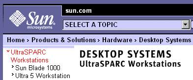
This example is taken from Sun's web site and shows the us12下一頁
- 上一頁:英國航空公司網站表單設計
- 下一頁:導航標簽
小編推薦
熱門推薦