導航標簽
編輯:關於網頁技巧
Problem
Users need to access a particular section of the entire avaiable informationSolution
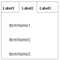
Show a horizontal row of tabs with the section label in the tab. Highlight the currently selected tab and make all other tabs clickable.
From www.dell.com/
Use when
You need to design your Main Navigation and you are considering a horizontal menu. Tabs are a common form of main navigation for information structures up to +/- 10 items.How
The tabs are shown high up the page and the area underneath it is connected to it visually. The information place in the tab pane belongs to the selected tab and can have its own sub-navigation. The currently selected category is highlighted by using contrasting color, shape, size, or typeface. It is best to create the needed contrast by making combinations such as color and shape.
By connecting the selected tab to the area underneath it, for example by making the both the area and the tab the same background color, the relationship is enforced even further.
The most frequent use of tabs is in a horizontal menu. The tabs are then used to separate categorized information. Another use is to show a (partial) view of one object, for example when showing a Product Page with sections about "Features", "Design", "Connectivity" etc.
Why
Tabs are inspired by their use in file cabinets where they separate sections of files. Although there are no real differences with a normal horizontal bar, the shape of the tabs makes the menu less boring and more visually outstanding.More Examples
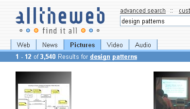
At Alltheweb a variation of tabs is used where the use is not to act only as main navigation, but as a filter for the type of results that are requested:
- 上一頁:面包屑導航
- 下一頁:10款PHP開源的電子商務管理系統
小編推薦
熱門推薦