基於FLASH的設計
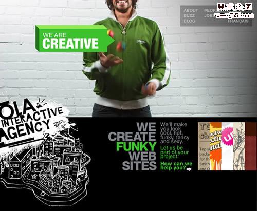
Ola Interactive Agency
A fun and straightforward website, with small videos running in the back to illustrate some of the company values, like creativity, speed and coolness! There’s a speaker on the left to kill the music.
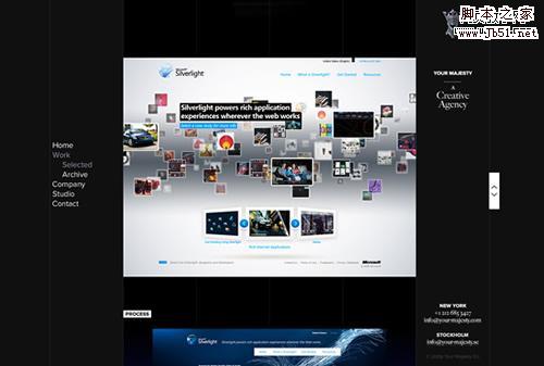
Your Majesty
Nice and clean website with more than one way to explore the portfolio, excellent branding, and a smooth dark color scheme.
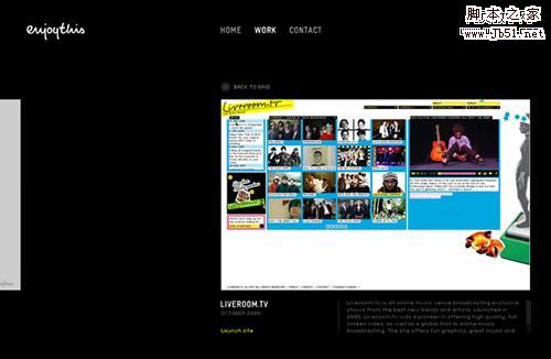
EnjoyThis
The minimal design and a sleek touch of Flash are the strong points of this one. Browsing trough the works seems so natural.
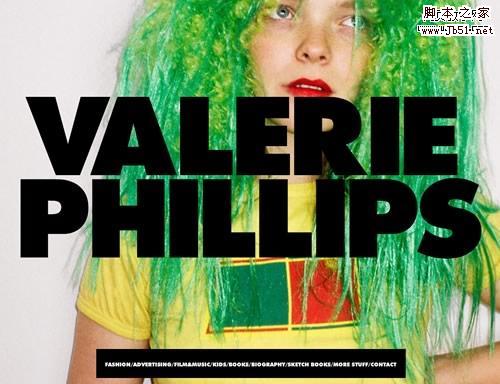
Valerie Phillips
This is huge. Literally!
Ben Thomas
A simple and effective left aligned website, with a stylish motion effect that works great with the dynamic visuals in the portfolio.
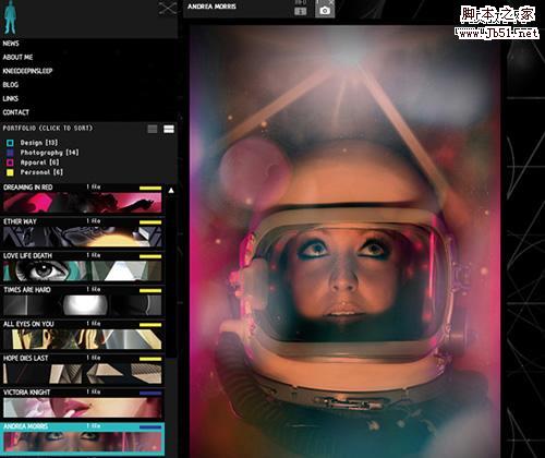
Studio Output
This one is for the average portfolio what Vimeo is for YouTube: a minimal yet powerful alternative, an almost buttonless experience.
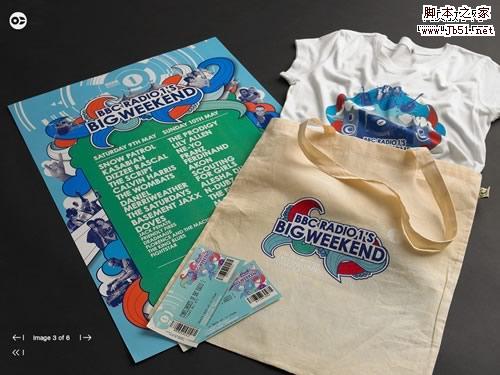
Lyndon Wade
A classic dark styled background with a thumbnail menu and awesome transition effects are all you need for a killer portfolio. Oh, and some pictures from one of the top 15 photographers in America.
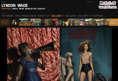
Cardon Design
A simple and innovative way to show the portfolio, in a dictionary way. Great works also!
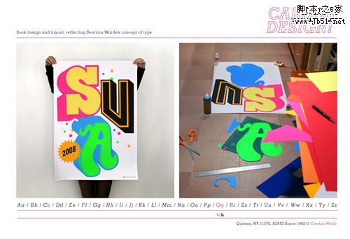
Kenjiro Harigai
One of the most complex websites in our selection, it features a visual menu with a lens effect, a text menu with the names of the works, and some amazing motion effects.
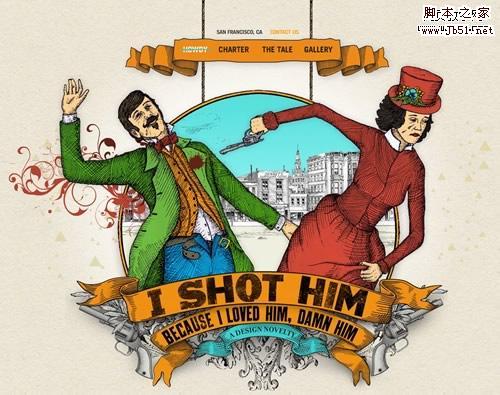
I Shot Him
This one is all about the story: with just a few vintage illustrations and some creative lines they really deliver "a design novelty".
上一頁12 3 下一頁 閱讀全文
- 上一頁:水平滾動的網站設計 小結
- 下一頁:50個漂亮的FLASH網站設計實例