Flash enabled designers and developers to deliver rich content over the browsers, creating motion, interactivity and an impressive visual experience. Good Flash-sites do not require too much bandwidth, load fast and allow for a smooth interaction; besides, beautiful Flash-based sites are Photoshop masterpieces, transporting some kind of reality and fantasy to the Flash movie.
In the showcase below we present 50 colorful, creative, interactive and beautiful Flash-based web-sites. Hopefully they will serve you as an inspiration for your future works or just entertain you on a lousy, boring Sunday.
You might also want to visit the following articles:
Drinks Sites
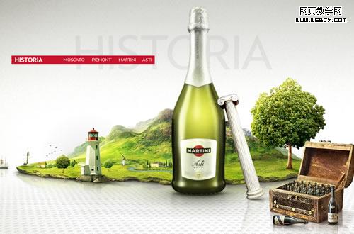
Martini Asti
This Martini site is a nice example of giving a fresh image of a drink. The navigation is made simple, the graphics have superior quality, it loads fast and runs smoothly. What else does a Flash site need? Note due to the law on alcoholic drinks, you need to enter an e-mail address, a password of your choice and accept their terms.
Glacéau - Vitaminwater
The vitamin water site is full of motion and small details like the top menu, with a colored wave effect, the mouse movement, the masks effects and swirls which make it great.

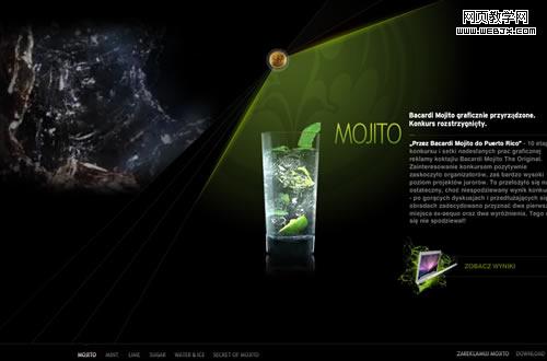
Bacardi - Original Mojito (currently offline)
The motion graphics and the water effects in slow motion give a unique style to this site. A fresh site, with a colored menu with a drag option, makes it functional and simple. Note: due to the law on alcoholic drinks, you need to enter an e-mail address, a password of your choice and accept their terms.
Portfolios
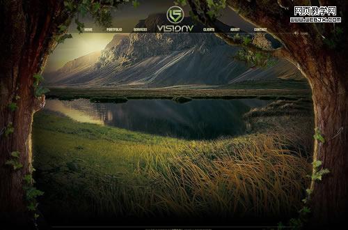
v5 Design
Beautiful landscape with some nice details such us the sun and butterflies. The old paper effect when opening from the menu, and the mask effect over the green plants give it a special touch.
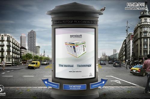
Sensisoft
The Sensisoft site offers a nice interaction for users. The vortex effect while changing from path, the motion graphics in the background, the high quality and details of the graphics make it a great design agency site.
Mauricio Guimarães Portfolio
Mauricio portfolio is a good example of creativity. Instead of the ordinary menu, he uses a kind of parallax movieclip, where the user must interact with the stage to explore the site.
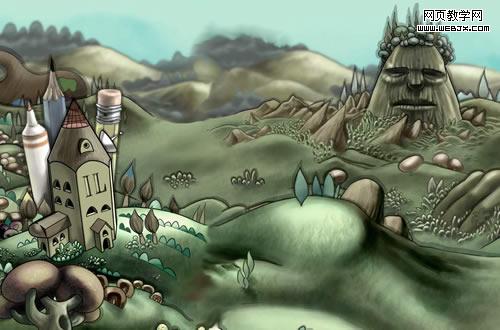
Colorchakra - Portfolio of Srinath Rangamani
A colored background with high quality graphics.
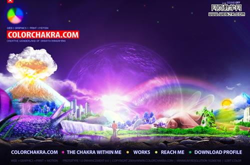
Magnivate Interactive Boutique Agency
A nice animated site. One particular feature on this site is that you need to set a character to explore the site.
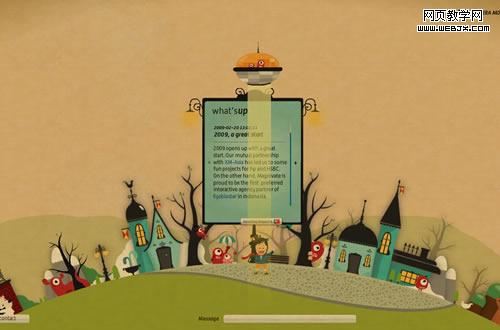
e-Content Solutions
This studio portfolio starts with a nice and unusual preloader, a kind of puzzle which interacts on mouse rollover. Another kind of interaction is user’s ability to explode the balloons.

Ari´s Labs. The Digital Home of Graphic Designer Ari Hirvonen
The high quality of motion graphics, conception and the functional layout makes this site a good example of what a Flash portfolio should look like.
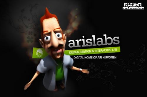
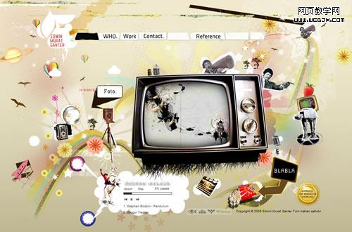
Edwin Murat Ganter Portfolio
A simple and creative layout. Not common, but still practical and easy to use.
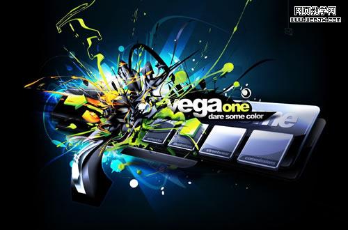
Vegaone
Color effects and 3D layout on this site are remarkable. However, it could be improved with some motion graphics and page transition effects.
Infinit Colours
This site gives the user the option to change the background between beautiful high quality designs. The menu is also a creative alternative to deliver some interactivity.
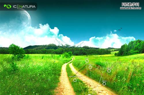
Infographiste Indépendant
Another creative portfolio, full of interactivity and motion graphics. The background image is great.
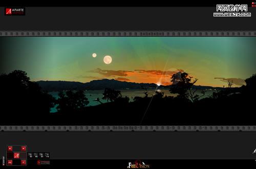
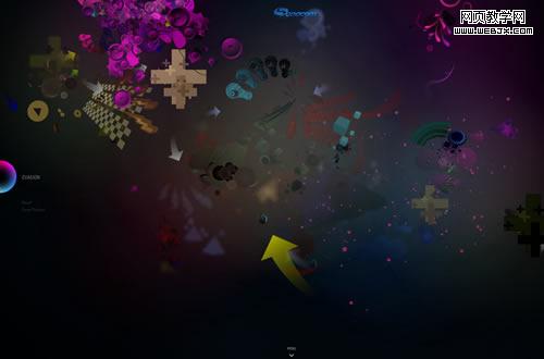
Sonacom
A great Generative Art example which requires the user to interact with the stage.
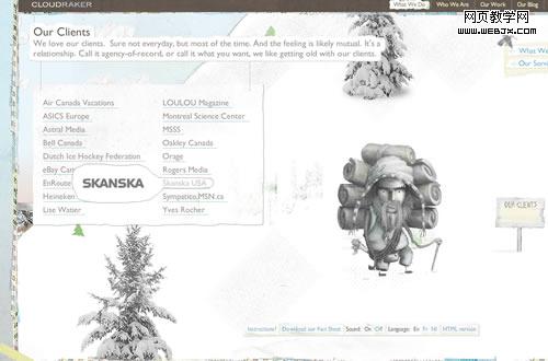
CloudRaker
On this site you can use the character to move along. The graphic element is great and the concept it unusual.
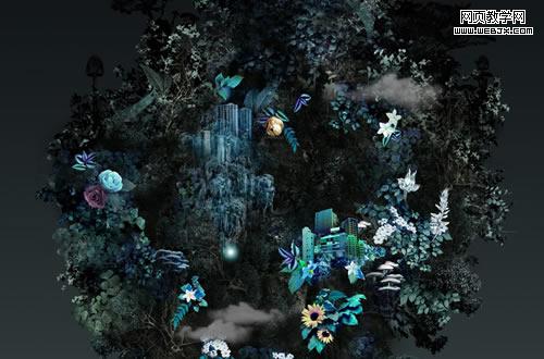
Prismgirl
A great creative portfolio, using an unusual layout.
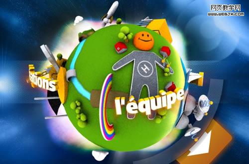
Agence Secondlife
At a first glance this site needs the user to interact with it in order to move forward. Rather than the graphics quality, this site creates a 3D globe, full of color which is a creative option to move around the site.
Digaworks Corporation
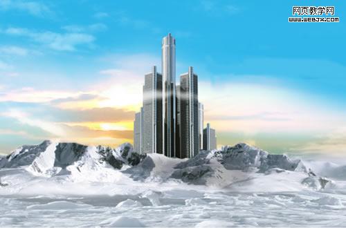
Zign Marketing Digital
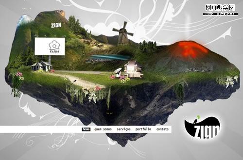
Mon-Monde
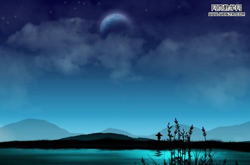
Elipse Agency
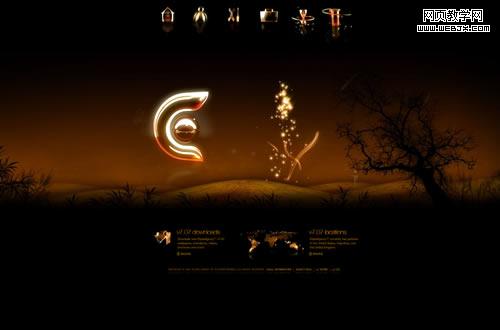
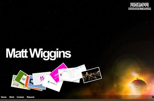
Matt Wiggins Portfolio
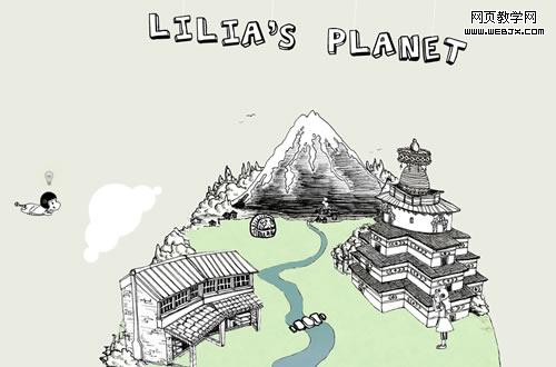
Lilia Planet
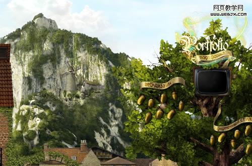
Ladio
上一頁12 下一頁 閱讀全文